
9.17.2010
Better to Receive?
9.16.2010
I Want One


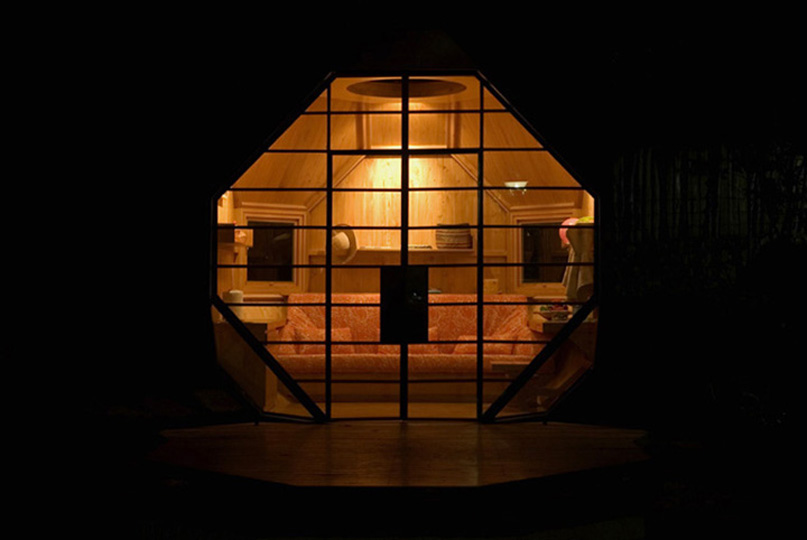


I don't speak Spainish, but the architect's (I'm assuming its the architect) website has more photos, here: http://www.manuelvillaarq.com/index.php?/project/poliedro-habitable/ .
9.09.2010
Recipe for a Dining Room: How to decorate a room from inspiration to (almost) finished
I have some better pictures from the dining room shown in my last post. Unfortunately, my professional photographer (aka my partner's twin's girlfriend) wasn't able to come with me to the client's home today, but I did manage to find a decent camera.
For those who are interested in the design process, I thought I'd share the steps taken on this room for it to come together.
 1. Inspiration/brainstorming/fact finding. This dining is room is in new construction, and I started working with the client early in the process, which made a lot of things easier. One first consideration is that the client prefers a very simple, clean look, natural materials, a monochromatic colour scheme, and dark hardware. That meant that the dining room would have to have the same dark stained concrete floors and neutral wall color (Manchester Tan from Benjamin Moore) as the rest of the open floor plan ground floor. These preferences also gave direction to the choices of rug, upholstery fabric, and window treatment. She also knew that she wanted slipcovered side chairs in a light fabric (two young boys meant that she couldn't have the light sofa she prefered, so she wanted the cream somewhere), contrasting host/hostess chairs, and a natural wood table.
 2. Find a starting point. These great Chinese chairs in a dark teal blue were our very first purchases for the room. I don't know if they are actually vintage or are reproductions, but they have a great patina and distressed character. And, quite frankly, they're not that comfortable. But the client loved them, kept turning back to them despite hesitations, and finally broke down and bought them. I think they make the room. In fact, the colour is so beautiful that we pulled the wall color for the nearby powder room from them.

3. Fill in the other major players. In a dining room, it's usually the chairs and table that are the pieces that really set the tone of the room. Once we had such striking host chairs, I knew we needed to keep the side chairs simple, so I found some inexpensive leather parson's chairs (I prefer for slipcovered chairs to be upholstered in complementary fabric so the room looks good even when they are being laundered...you never know who might drop by on wash day) and had them slipcovered in a simple washed natural cotton. I kept the skirts short because it's not a big room--it's rather narrow, and I wanted the eye to pass through the legs and not be stopped short by floor length skirts.
The table was more of a problem: we wanted a farm table, but since this is the "formal" dining room, the client didn't want it too rustic. We also had to find a narrow table--the standard 48" would be too wide for the room, especially after adding a buffet which the client (let's call her "Babs"...I'm sick of typing "the client") needed for storage. Babs is also a fiend for beautiful natural wood and hated all of the veneering that is commonly available. Therefore, we had the table custom made (by Wilkerson Row on Magazine St. for anyone local who needs some beautiful custom furniture) out of cypress with a natural finish. I made sure the wood colour co-ordinated with the wood exposed by the distressed Asian chairs' finish. We were able to pick our own dimension, a lithe 96X40, graceful cabriolet legs, and minimum detailing. Babs was thrilled by the beautiful planks selected for the top.
 At that point, we selected very simple window treatments (creamy linen panel) and a plain rug (sisal), to let the beautiful grain pattern of the table stand out.
 4. Pull it together. At this point, the major elements were in place: flooring, wall colour, rug, window treatments, dining table and chairs. Time to tackle the back wall. All along, we planned on a buffet and art for that wall. A buffet because the client needed storage and dislikes china cabinets, and art because, while I love a monochromatic palette with a soothing lack of pattern, you need something with movement, live, and a mix of colours.
The art actually came first. I painted the two canvases as a housewarming present, and used the soft blues, greys, greens, and tobacco browns that the client loves. The colours in the art pull from the accent colours used (sparingly) in the adjoining spaces.
The buffet was a more difficult task. It needed to include storage, so an open console was out. It had to be on the shallow side (no more than 18"), it needed to be quite long (around 90"), it couldn't be too high (the ceilings are 10", so a too-high piece would have killed the spacious look of the light filled space, it couldn't be too heavy in feeling (it's not a large room and the client hates overdone, over-carved pieces), it had to play second fiddle to the heavily grained table, and it had to be in a finish that co-ordinated with the natural cyrpess and the Asian chairs. We found a close contender at Restoration Hardware, but the finish wasn't right, and the homeowner hesitated at painting a brand new relatively expensive piece of furniture (not to mention the cost a good decorative finish would add). Again, a custom piece by Wilkerson Rowe was the answer. Again we could choose our own, difficult to find dimensions, we could choose our finish colour, and we knew it would be beautifully crafted locally of solid wood.
In the comments section of the last post, Marlo asked about the hardware. I found it on-line at House of Antique Hardware. I chose this particular hardware for a couple of reasons. 1. My client likes simplicity and clean lines; therefore, I knew the buffet would have little detailing, but it needed SOME interest. I thought prominent hardware would add some punch, but since it's actually useful, Babs wouldn't consider it unnecessary. I also like the matt black finish because it co-ordinates with the oil-rubbed bronze finishes throughout the house. I don't mind mixing finishes, but when you're going for a simple look, co-ordinating them does add polish. And a dark finish always looks striking when the paint colours used for walls, trim, and doors is light. 2. Because I wanted a vintage feel reminiscent of the beautiful bookcases by BoBo intriguing objects, I thought using traditional H-L hinges and latches instead of pulls would give that feeling of age. 3. I liked the hardware, and I'm the decorator, and what I say goes (sometimes...actually not that often, but sometimes). The details didn't photograph, but are really nice in person..the backing of the cabinets is beadboard, the sides are planked, and we specificed thin, thin, thin layers of paint so that you can still make out the graining.

 5. Finish up. Actually....that I haven't done yet. We need something permanent for the table, candle sconce to flank the art and something for the side wall. But, this has been a project I've loved working on, and I couldn't wait to share it.


3. Fill in the other major players. In a dining room, it's usually the chairs and table that are the pieces that really set the tone of the room. Once we had such striking host chairs, I knew we needed to keep the side chairs simple, so I found some inexpensive leather parson's chairs (I prefer for slipcovered chairs to be upholstered in complementary fabric so the room looks good even when they are being laundered...you never know who might drop by on wash day) and had them slipcovered in a simple washed natural cotton. I kept the skirts short because it's not a big room--it's rather narrow, and I wanted the eye to pass through the legs and not be stopped short by floor length skirts.
The table was more of a problem: we wanted a farm table, but since this is the "formal" dining room, the client didn't want it too rustic. We also had to find a narrow table--the standard 48" would be too wide for the room, especially after adding a buffet which the client (let's call her "Babs"...I'm sick of typing "the client") needed for storage. Babs is also a fiend for beautiful natural wood and hated all of the veneering that is commonly available. Therefore, we had the table custom made (by Wilkerson Row on Magazine St. for anyone local who needs some beautiful custom furniture) out of cypress with a natural finish. I made sure the wood colour co-ordinated with the wood exposed by the distressed Asian chairs' finish. We were able to pick our own dimension, a lithe 96X40, graceful cabriolet legs, and minimum detailing. Babs was thrilled by the beautiful planks selected for the top.


The art actually came first. I painted the two canvases as a housewarming present, and used the soft blues, greys, greens, and tobacco browns that the client loves. The colours in the art pull from the accent colours used (sparingly) in the adjoining spaces.
The buffet was a more difficult task. It needed to include storage, so an open console was out. It had to be on the shallow side (no more than 18"), it needed to be quite long (around 90"), it couldn't be too high (the ceilings are 10", so a too-high piece would have killed the spacious look of the light filled space, it couldn't be too heavy in feeling (it's not a large room and the client hates overdone, over-carved pieces), it had to play second fiddle to the heavily grained table, and it had to be in a finish that co-ordinated with the natural cyrpess and the Asian chairs. We found a close contender at Restoration Hardware, but the finish wasn't right, and the homeowner hesitated at painting a brand new relatively expensive piece of furniture (not to mention the cost a good decorative finish would add). Again, a custom piece by Wilkerson Rowe was the answer. Again we could choose our own, difficult to find dimensions, we could choose our finish colour, and we knew it would be beautifully crafted locally of solid wood.
In the comments section of the last post, Marlo asked about the hardware. I found it on-line at House of Antique Hardware. I chose this particular hardware for a couple of reasons. 1. My client likes simplicity and clean lines; therefore, I knew the buffet would have little detailing, but it needed SOME interest. I thought prominent hardware would add some punch, but since it's actually useful, Babs wouldn't consider it unnecessary. I also like the matt black finish because it co-ordinates with the oil-rubbed bronze finishes throughout the house. I don't mind mixing finishes, but when you're going for a simple look, co-ordinating them does add polish. And a dark finish always looks striking when the paint colours used for walls, trim, and doors is light. 2. Because I wanted a vintage feel reminiscent of the beautiful bookcases by BoBo intriguing objects, I thought using traditional H-L hinges and latches instead of pulls would give that feeling of age. 3. I liked the hardware, and I'm the decorator, and what I say goes (sometimes...actually not that often, but sometimes). The details didn't photograph, but are really nice in person..the backing of the cabinets is beadboard, the sides are planked, and we specificed thin, thin, thin layers of paint so that you can still make out the graining.


9.07.2010
After a Sleepless Night
Interior Designer/Decorator is one of those professions that seems very glamorous and fun. Inspired by series like "Designing Women" and movies like "Pillow Talk," where decorator Doris Day can afford a Manhattan apartment, a daily maid, and enough jewels and furs that her jeweler and furrier both carry screen credits,
a lot of people think design mainly involving lunching with clients at expensive restaurants, jetting off to NYC and Europe for shopping sprees, and waving your hands at contractors and subs, saying, "Just make it happen, darlings."
And it can be a fun job. Occasionally (very occasionally except for the exalted few at the top of the profession), there is glamour. But there is a lot of headache. And worry. And sleepless nights. And nothing can cause a sleepless night like waiting for the arrival of a custom piece. Today was the day that a client's buffet was going to be delivered. A completely custom piece that I designed, including paint color, dimensions, and hardware selection. And I did not sleep a wink last night.
Today, though went very smoothly. It can, the delivery men where delightful, and the colour was perfect.
 I snapped some quick picks to give you an idea of how the room is turning out. Better pics (from someone else) to follow one we finish styling the room. Thank God, I will be able to sleep tonight.
a lot of people think design mainly involving lunching with clients at expensive restaurants, jetting off to NYC and Europe for shopping sprees, and waving your hands at contractors and subs, saying, "Just make it happen, darlings."
| A lonely room. |
Today, though went very smoothly. It can, the delivery men where delightful, and the colour was perfect.
 |
| I painted the diptych over the sideboard as a housewarming gift. |

9.05.2010
The Letter
 | |
| Dame Barbara Cartland penning one of her early works of literary genius. |
I wish I had written this letter to myself in 2007:
Dear 2007 Mitchell (heretofore known as "Dumbass"),
Please don't paint your stair hall deep terracotta orange.
I don't care how much you "love" the colour. In the near future you will grow to hate it and want it to be painted in one of the only two colours you have used consistently, liked, lived with, and not regretted since your first apartment in 1995; namely, robin's egg blue or off-white. Please don't insist that "life is too short for neutrals" or that you "need a change."
You, Dumbass, no matter how much you protest otherwise, only really like two kinds of wall colors: those that run the exciting gambit from creamy off-white to pale golden kakhi or those that range from grey/green/blue to blue/grey/green to green/blue/grey. No matter how hard you try to convince yourself that you are some sort of bon vivant BoHo artist, you are only a repressed small town Protestant who can't handle that much excitement in decor.
Shortly, in order to save your sanity, and only after resorting to emotional blackmail (which will leave you feeling bad--at least until the margaritas kick in---you will need to increase your self-medication from wine to tequila), you will have to convince Thomas of a need to change the paint color that YOU insisted on over his objections. You will then have to paint layer upon layer of Rainwashed over that orange during Labor Day Weekend while the rest of country cavorts around you, as that will be your only spare time. And you will grow to hate life,
Sincerely,
Mitchell 2010
9.04.2010
Favorite Room Ever and an Update
 |
| Add caption |

And I've also delayed the project because I have managed to do everything I would never do for a client project: move furniture without preparing a floor plan, start painting without testing color, begin project without determining installation timeline, and trying to make finishing detail decisions without completing the beginning phases of the project---in fact, I've been impulisive, unorganized, and indecisive----exactly the kind of client that I find a pain in the ass.
Any way, since I'm painting the walls in one of my favorite colors, Sherwin Williams's Rainwashed, I was reminded of my favorite room ever published in Elle Decor, way back in 2001. I lost the magazine in post-Katrina flooding, so I don't remember the designer, except that he was an ex-model named Ren who had just moved to L.A.. Luckily, I had removed the cover and it happened to be with some paperwork I took with me one the evacutaion. You can tell by all the folds and wrinkles in the scan how often I've studied it.
The room just encapsulated everything I personally love in a space: the blue/gray/green walls, the plain offwhite slipcovers, the touch of asian, the accents of dark brown/black, cream and camel. It's a palette and look I've loved as long as I remember. Periodically, I get the urge to try something new and incorporate bolder colour (i'm looking at you orange), more pattern, and different materials into my decor. But eventually, I always end up back with elements similar to the one in the Elle cover. After the painting is finished, my living/dining room and office/stairwell will have this same creamy white, pale robin's egg blue palette, with carmel and dark accents---I can hardly wait.
Until then, here are a couple of rooms via Erin at House of Turquoise featuring Rainwashed (www.houseofturquoise.com : keyword: rainwashed) :
 |
| Abbe at Studio ten 25 |
 |
| Jo Rabuat |
Subscribe to:
Posts (Atom)