10.12.2011

How to Choose a Paint Color from a Photograph

      Choosing a paint color can be both one of the most fun and one of the most challenging parts of decorating.  The right paint color can make a room, bringing cohesion and excitement to a design scheme.  On the other hand, the wrong paint can bring misery and wasted expense.  The conventional thought on paint is that "it's a quick and easy way to change the look of your room."  And that can be true, especially if you live in an older, traditional home with ceilings of moderate height, small rooms, and few heavy possessions.  In fact, when I was in my twenties, living in a smallish apartment with 8 foot ceilings, few responsibilities and  with nothing more than a motley collection of light-weight hand-me-downs, I changed the color of the walls so often that my cousin Barbara joked that I must have reduced the square footage.  These days, however, I just don't have the time and inclination to take down masses of art, remove books from shelves, and dismantle curtains;  and for people with open floor plans and soaring ceilings, it can be very time consuming and dangerous to do it themselves and be very expensive to hire painters.  Therefore, for a lot of people, a paint color is a big commitment.

     In addition to the task of painting, just choosing the right color can be a large undertaking.  Even if you have a specific color range in mind, it can be hard enough to pin point the exactly right color.  This task becomes even more difficult when you don't even know what color you want.  Bold or subtle?  Neutral or dramatic?  Trendy or timeless?    This is when man (including myself) turn to magazines and blogs for color inspiration.  Taking your color choice from a photograph, either print or digital, does have certain inherent dangers, however.   Here are some Do's and Don'ts to help guide you to the perfect color.


DO make sure that there a least some similarities between the photographed room and your own space.  Color is relative;  that is, many factors determine how a color will look the room.  These factors include the type and color of flooring; the amount, color, and placement of trim; the type and amount of lighting, including natural light; the color of furnishings, window treatments, and adjoining rooms; the size of the room; and the height of the walls.  The more features that match between the inspiration room and your own room, the more likely the paint color will look the same in both spaces.

For example, look at the entirely different effect created by black paint in these two rooms:  In the first room, even with the black walls, the overall feeling is still very bright because of  light floors, sunlight streaming in from large windows on two sides, lots of white on furnishings, ceiling, and upper 1/4 of the walls.

The second room, however, feels much moodier because it is smaller with dark floors, less natural light and dark furnishings.  It's a beautiful room; but if you were aiming for the high-contrast, bright, crisp and airy feeling of the first photo, you would be sadly disappointed.


DO carefully read the text and resource lists (in the back of most shelter magazines).  They often list the paint names of some of the more heavily featured and  interesting rooms.  Some designers will even respond to e-mail and phone requests for paint colors.  When my former boss designed a Southern Living show house, she instructed her assistants and office staff to politely and  cheerfully respond to most source requests.  Be aware, however, that many designers feel that their sources are important business assets  and don't like to "give it away for free."   In such a case, respect the designer's decision to keep his source secret.

DON'T assume the color in the photo is true to the actual swatch.  The way a color photographs, depending on the lighting, etc. can give a very different impression than the color found in the fandeck.  Furthermore, the printing process for magazines and the effect of monitors can make colors appear very different than they do in real life.  Just think about items that you have purchased on-line that arrived looking very different than they did on the website.  And that's even before thinking about the wide-spread use of photoshop to enhance or tone down colors for the sake of creating just the right image.

Altered version.

Accurate version.

Two shots of the same room by two different photographers.  The difference is subtle, but noticeable. In the first picture, the walls and blue/green accents are much greener, and the bed appears almost white.  In the second photo, everything is warmer, and the bed looks cream.  I don't know which is more accurate to the real room.


DO have the paint store computer match the actual photo.  This works better is you have a print photo from a magazine, but if the photo is from a blog, print the highest quality version that you can, making sure the printed version matches the color you like on your monitor.  For this to be an option, however, there needs to be a largish section of the photo that shows the paint color uninterrupted, around 3 square inches (or approx. the size of a paint swatch).  I have found that specialty paint stores like Sherwin Williams and Benjamin Moore are more likely to be able to do this successfully, and can tweak the color if it still doesn't match.   If you don't want to go the route of a custom match, you can just try to match the photo to existing colors in a company's fandeck or swatch collection.
This photo would NOT be a good candidate for computer matching--not enough wall area clear.

This photo is a much better candidate for computer matching with the large empty area of wall in right hand corner of photo.
DON'T leave out sample testing.  I think it's important to test paint colors, period.  Especially paint colors used in large or difficult to re-paint rooms.  Because of the difficulties described above, it's especially important to test in the use of a paint color from a photo.

It may take a while to find your perfect paint from a photograph.  Don't be discouraged, it can happen.  I found my perfect office and stair hall color from a HB article (post here).  In my case, the printed swatch and photo was true to the actual color.  I still tested though.  Good luck!

10.10.2011

A Way With Windows: How to turn old windows into mirrors, chalkboards, and frames

For Susan's at Between Naps on the Porch Monday Metamorphosis, I have 4 ways to make over old windows.
Our old windows....a stack of possibilities.  And yes, that is a giant pink flamingo you see reflected in the glass.

I'm a scavenger.   Always have been.  Maybe it's because I grew up on a farm in the middle of nowhere, which means you had to learn to make do, adapt, and figure out ways to substitute and reuse.  This is crucial because if it was  a Sat. night after 8:00, there was no nearby store open to make a quick run to for whatever supply you ran out of it.  You learn to adjust:  need more lining for the curtains you're making...use that old sheet with the worn spot in the middle.  Forgot to buy the can of cream of mushroom soup you needed for your casserole (I swear to God, if you stacked all the cans of Campbell's condensed cream of mushroom soup that my mother used, it would reach to the moon and back)...make a white sauce with the milk, butter, and flour that you do have.  Not to mention that there is also the fact that raising a family on the combined salary of a country school teacher and a small acreage farmer meant that there were two places to put every dollar.  In any case, this early experience honed my ability to spot the potential in almost anything.
Is it wrong to love chipped and peeling paint so much?

Case in point:  When we renovated the house, Thomas felt strongly about trying to make the 1930's structure more energy efficient, including adding blown insulation to the attic and replacing the windows.  We tried to donate them to a local architectural salvage yard, but at that time, with the amount of rebuilding following Katrina, they were a glut on the market.  We did give some to friends, and I used some in a staging job, but we were left with a stack of them.  And I let my imagination run wild.

As Wall Art

Here, I used an unaltered window to feel the space behind a large lamp.  I needed the white of the frame plus the sparkle of the glass to balance art on the other side of the sofa.  (of course, by now both window and other art has been shifted.)
You can actually used the windows as is (with a good cleaning of course) to add interest and dimension to the wall.  There are great behind lamps or other accessories where you may need a little something, but don't want to block a piece a mirror, or don't want the visual clutter of a piece of art.
Mirrors
Is there anything better than chippy wood and antique mirror.  Maybe, but that combo is pretty sweet.  I took two of the windows, cleaned them well to remove the loosest paint (note:  be aware when doing this with old windows that they might contain lead paint.  Take the necessary precautions for safety), and sprayed the back with Krylon's looking glass paint  (Here.  I bought mine at Michael's, but it's available on line)  Now I have to be honest and tell  you that I've only used this to mimic antique mirror---i.e. cloudy, dull, with an abscured reflection---I don't know that if you use enough of the spray if it can turn glass into a true mirror.  Use thin layers, but honestly, the thing about an application like this is that imperfections (drips, heavy areas, etc.) actually add to the look.


Frames
I love the look of unframed canvas art, but sometimes it needs a frame...either for more presence, a more finished look or because you have an unstretched piece of art.  In any case, I had one window that had had the glass broken.  I also had a piece of artwork on burlap that needed a frame.  I cleaned the frame and polyureathaned it to stabilize the chipping (if you want to do this, but don't want the telltale shine of poly, be aware that it comes in matte and satin finishes, and that polyacrilyc which is waterbased won't tint the piece slightly yellow as oil based poly will).  I then simply stapled the art to the back of the frame and screwed in d-ring hangers (available at Home Depot.)  It would be a quick, simple way to add character to a mass produced giclee or art work printed on canvas.  If the giclee is stretched, just remove the staples or use a razor blade to cut free.
An old window frame, including hardware, perfectly suits one of my own paintings.

Chalkboard
Let me start off by saying that this is probably not a project that you want for a house where small children, teens, or careless adults will be using the chalkboard.  Carelessness + glass = emergency room visit.  However, in my case,  I live in an adult household (we may not be fully mature, but we are fully grown), and I don't plan to use the chalkboard very often...In fact, I really plan to only use it for party and holiday messages.  Even though I don't plan to use it that often, I still wanted one...I guess Pottery Barn's marketing team can chalk up another victory for making all of America yearn for their own chalkboard.
I left on the sash strings for interest, making it look like it is hung by the top string.  I used part of the window latch as a decorative hook.  However, the window is actually mounted on the wall....the sting loop is just for show.  And in case you're wondering, "What the hell the message means...It's french for "long live Villa Vortex."  I thought our house should have a name, and Thomas suggested Vortex because so many funny things (both the "ha ha" and weird variety occur at house place) and I added the Villa for maximum pretentiousness.  We even have customized cocktail napkins and matchbooks printed with our house name on them.


If you look close, you can see the crackle finish on the chalkboard.

I found a window with one large pane, making sure the glass was well caulked and sturdily in place.  I coated the glass with a layer of an adhesive primer (x-i-m) tinted dark gray.  Now this is a case where serendipity occurred.  I was so anxious to have my chalkboard that I applied the chalkboard paint before the primer was fully dry...it shrank, giving the chalkboard a crackled effect that matched the chippy frame.  Once I determined that I could still right on the chalkboard, I was thrilled.  My impatience usually does not bring positive results.

Sharing at:

10.08.2011

Some Press

Arvinder and Pardeep (the chef) Vikhu, owners of Saffron NOLA.  I painted the Indian bride painting in the background and revamped the Saffron sign on the right wall.
A restaurant that I worked on just got reviewed in a local publication, Gambit Magazine (review here).
While the review focused on the food (which is delicious), the reviewer did give a shout out to the decor, calling the restaurant "stylishly decorated and very welcoming."  If you are ever in the New Orleans are and want some high-end Indian influenced food, check it out.  But they're only open on Friday night.

You do have to go to the West Bank though, so make sure to bring your passport.  


Saffron NOLA
505 Gretna Blvd.
363-2174
www.saffronnola.com

10.07.2011

How to Fake a Window Seat:: The Reveal

   Believe Jiminy Cricket, folks:  dreams can come true.  After years (and with a landmark birthday fast approaching, it a little unsettling to think about exactly how many years it's been), I finally have the window seat I've always wanted.  Every decor fiend has at least one feature or item they want, inspired by t.v. and movies, books, friends' houses, etc.  Growing up a romantic in a (at least it felt that way then) drab '60s ranch hosed down in pine paneling, I dreamed of attic bedrooms and garrets (ala Anne of Green Gables) with dormer windows and built in window seats.  It seemed during my tween and teen years, every single t.v. and movie teen had an upstairs or attic bedroom with one or more, and it tormented me.  I've spent most of my adult life in a series of architecturally undistinguished apartments.  For a while, I did actually rent a fantastic attic apartment in the French Quarter that had dormers; alas, it had no window seats.  Sigh.  I then consigned a window seat to the ever growing (and quite frankly rarely regretted) list of things "I'll Never Have..." (Cue the mournful violin music---maybe something from the death scene in La Boheme.)  Anyway, I finally realized that this nook in the upstairs hall was a perfect spot for creating my dream seat:

It wasn't usually THIS cluttered, but instead of cleaning up before the pic, I decided the uglier the BEFORE the better the AFTER looks, right?


Unfortunately possessed of more style than money (aside:  that used to be a long running Vogue column:  "More Taste Than Money" featuring stylish, but low cost (at least Vogue's version of low cost) items...don't you love it?) and rudimentary, at best, carpentry skills, I tried to think of a way to construct the window seat (which I knew was mainly for looks, not use, and therefore didn't need to be of the sturdiest construstion)easily and cheaply.  While thinking, I came across this:

Miraculously, the dimensions were perfect: height, width, and depth all fit within 1" of the nook.   I planned to use existing curtains that were being stored:


And put together this plan:

To create something like this:


However, I wasn't thrilled with the result:

So, back to basics.  First, I realized that the cushion that came with the bench was too skimpy, so I took care of that.

Then I realized that these curtains might work.
Curtains (made from vintage sheet) in original kitchen location.

By now, they had migrated to the home office. (Please ignore the fact that curtains are falling down and room is half-striped...this was in the midst of the dining room/home office switheroo.  here and here.)

I let out the hem and hung them.  Much fresher and brighter than the orange print, and they were long enough and thin enough to hang on the outside of the seat like the inspiration pic I loved,  but there was a huge gap between the ceiling and the top of the window sill.
It's hard to tell, but the matchstick blinds are actually a lime and natural combo.
I needed a valance...bummer.  However, I remembered that I had purchased a fabulous Echo shower curtain when Linens N Things went out of business that had all the right colors to tie everything together.  Even better, though I loved it, I had never decided what to do with it, and it was gathering dust in my table cloth drawer.  I whipped out the sewing machine and made a valance and lumbar pillow.
Note:  I plan to shorten valance, but honestly, after working on this window for so long, I don't have the will to do it right away.
Detail of pillow fabric.

Now to accessorize, and boy, did I.  In fact, I went overboard.  It ended up looking like the decor version of a Kardashian...pretty enough, but overstuffed and a little on the tacky side. 


So this morning, I de-cluttered, and voila:


I felt it needed a little table, so I used this vintage fire extinguisher as base with stacked books as a top.

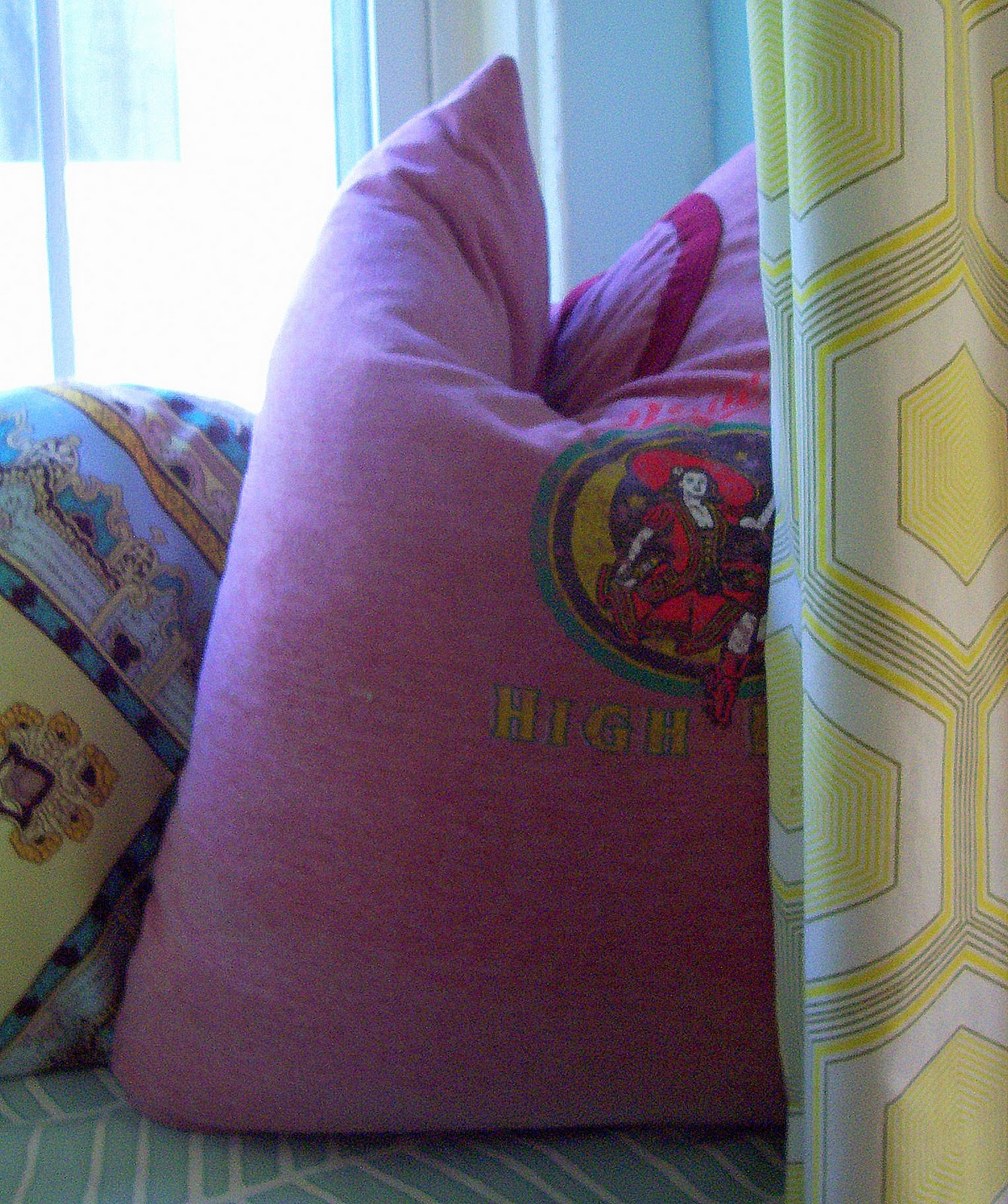
I overdid the karate chop, but I love this pillow I made out of a vintage logo tee.  The pop of red was necessary to tie to colors in adjoining spaces.  Plus, it keeps the window seat from being too precious.
Finally, my own window seat.  And the best part is, except for the cost of the bench (around $70) everything else was stuff I already had....this is why I suffer....the part of my that fears ending up on Hoarders says "Throw it out...you haven't used it, you don't really need it,"  while the other half sneers, "What did you say about not needing it....I can't hear you over the sewing machine while I make this pillow out of this shower curtain that's been waiting in a drawer for 5 years...you know, the one you didn't think it needed."  And yes, sadly, these conversations do occur in my head with my warring halves.  Perhaps I should put down the needle and get to a doctor.

*note*  I'd like to thank everybody who's read about, commented on  and encouraged me in this project.  It really means a lot.  Thank you.

10.06.2011

Window Seat Update

As I mentioned in my previous post, the window seat project hasn't been turning out as well as I hoped.  I hoped for something like this:

Light, bright, fun, obviously custom, obviously expensive looking.

Instead, after going for the brown option (the white one was just too cheap looking, and quite frankly after struggling with the horrors of assembly, I had so many gaps that they would have ruined the effect of the white one anyway) and trying to put the look together with as many existing elements as possible, I got this:
Dark, drab, dull:   a big ol' mess

Now, I'm not trying to be all false modest, pretending that's it's a big ol' mess so I can have readers assure me that's it great...it's not.  Don't get me wrong, the window nook is  certainly not the ugliest thing on the web...in fact, it's not even the ugliest thing I've seen on a design blog today.  What it  certainly is NOT is bright, fresh, and custom looking.  It looks exactly like what it is....a prefab piece of furniture overstyled in an attempt to disguise that fact. 

After putting this together, I was so bummed I just let it sit that way...I didn't even want to try to tweak it.  But lately, the weather has been beautiful, the windows are  open, and I decided to revisit the window seat project and see what went wrong.

The problems areas I identified:

1.  The color.  Now, I don't regret not getting the white one, but switching to brown did change the balance---with a white window seat, that brightness would have balanced the heavy fabrics.  I didn't think to reverse it (i.e. brown seat, light fabrics) so I ended up with an overall very heavy look.

2. The draperies just didn't work.  This is always a problem in trying to retro fit window treatments.  I tried hanging them in front of the seat like the inspiration---they are too short to hang from ceiling and hit floor, so I had to hang them just below picture rail, but the empty space above looked awkward.  I had toyed with topping that space with a shelf and books, but that seemed too heavy and busy and even more unlikely to look like a custom buit-in---so I switched to hanging them from window wall with excess length tucked. behind seat---but, they look like what they are...heavy curtains that are too big for the window and that are crushed behind the furniture.

3.  Rush job---I was so excited about the project, that I rushed into the execution.  When I saw problems with draperies-instead of pausing to really evaluate, I just pushed through.  Same with pillows--instead of taking time during construction, I slapped them together, thinking "They won't really be seen closeup.  Good enough is good enough."  Of course, when you are trying to achieve a high end  look, good enough never is.  Good enough is the difference between d-i-y looking professional or homemade.

4.  Cushion.--At first, I was thrilled with cushion.  It has cording and is in nice neutral fabric that worked with orange print draperies.  However, fabric looks and feels synthetic and a little cheap.  Furthermore, it's just so dinky.

So I went back to inspiration photos and looked at options.

1.  Problem that can be fixed...cushion looks dinky.  As a first step, I've decided to slip the cover and top of the seat to create the look of a thicker cushion, hide some of the cubbies for a cleaner look, and use a brighter, more expensive looking fabric (luckily I had a remnant I've been dying to use in a project).  iI short, try to make cushion look more substantial and custom..

Progress so far:


Before final pressing

Compare this thin cushion and six cubby look with the above pics of the thick cushion and 3 cubbies.

2.  Switch curtains.  It's easy to get caught in thinking of certain fabrics and accessories going in certain rooms.  Case in point.  From the beginning of the project, I was determine to re-use my stored former dining ccurtains.  I never even thought about trying any other option.  Then yesterday, as I was in the office, I realized that I could switch these curtains (formerly my kitchen ones) with the orange and brown ones.  I knew the orange/brown ones would fit in the office--I made them fro there when that was the dining room;  further, the green ones currently in the office were actually quite a bit longer than the o/b ones.  Eureka.
Cushion fabric with drapery panel.


Now I'm off to tweak my green curtains.  Hopefully I'll have pics to show you tomorrow.

*update*  Here's a sneak peek:

10.05.2011

Decorating Indecision and D-I-Y Indigestion

How most of my d-i-y projects have fared lately.

Sorry, no updates.  It's been a combination of things---I went out of town for a while to visit friends in NYC and Charlotte, NC, and work has been busy.  It's a bizarre turn of events---time to blog=nothing to blog about.  However, plenty of blogworthy stuff= no time to blog.

Honestly, though, the real reason for no update is that I'm in something of a personal decorating slump.  I didn't even realize it, though, until reading Color Outside the Lines today where Artie described his own decorating issues.  In short, all of my recent d-i-y projects look like they have been attempted by a blindfolded hyperactive toddler with one arm tied behind his back, or the d-i-y projects are D.O.A. because I can't make my freakin' mind up.


A couple of cases in point.  A couple of posts ago, I told of my big plans for the guest room redo here and here.  Guess what?  Even though I've sampled the paint and bought it, I'm still hesitating over whether or not to go forward with that color.  I keep thinking about the bright green room on the cover of the Dec. 2010 Veranda and going, "Maybe THAT'S it."
 Why NOT just go with  the green?  1. I hate to waste the already purchased paint, and I don't have any immediate alternative use for it .  2.  I don't really have the money to keep buying new paint.  3.  Because of a variety of reasons, it's not just the walls in the room that would have to be painted if I didn't like the way the green paint turned out ---the trim (for a number of reasons) needs to be the same color as the walls, and I don't want to paint the trim more than once.  4.  I've never once, in the almost 20 years since I've left home, had kelly green walls.  I have had tobacco brown walls before (the paint color I've already purchased), and I know I like them.  5.  My concern is this:  while I feel it's nice to be open to new ideas and life is too short to worry about paint colors and to only use the same colors over and over again, I've learned that most people like what they like....it's easy to get sucked into doing something because it's new and different, but these impulsive decorating decisions have bitten me in the ass before.   6.  While it's a guest room, I will go into it often, and it will bother me if I don't like the color.  7.  The guest room is used a lot, and I'm not sure the green will be a soothing, restful color.  8.  I would going far from my original inspiration, which is a room I have liked for YEARS.

original inspiration


Why not just stick with the brown I know I would like?  Legitimate question.  1.  I am genuinely excited about the green in a way I am not about the tobacco.   2.  I feel like a hypocrite telling clients to go bold when I'm afraid to.

An additional problem:  lately my home projects haven't turned out well....my new bathroom curtains are going to have to be scrapped, and my window seat project has stalled (more on that later---let's just say St. Teresa was correct, "More tears have been shed over answered prayers than all the unanswered ones."  I got my window seat, but it is far from the fantastic feature I had hoped.)  In short, I'm running scared and am questioning all of my home decorating instincts---in fact, I can't even tell if my instinct is to just go with the green or the tobacco.  Maybe I'll fall back on "eeny, meeny, miney, moe...."

*update*  I decided to have a beer to calm frazzled design nerves---big mistake--now I keep looking at Heineken bottle thinking  "That shade of green would be a lovely paint color or an accent color in a tobacco brown room....."   aaaarrrggggghhhhhhh

*update* my gift subscription to Architectural digest has arrived.....maybe Margaret Russell has the answer to my problem.....


*update* Ms. Russell comes through:  these images from a beautiful Manhattan apartment have made me realize why I love tobacco walls so much, especially with maple furniture (which the guest room will have).   Sold on tobacco brown!