8.05.2011

How to Program a Room: Dining Room Reveal


Back to a dining room.

A few months ago, I shared my dining room/home office switcheroo.  For a quick recap, when first moving in, I used the second space of my double front room (in these New Orleans Shotguns, it is typically used as a dining room, but I wanted to be different) as a home office/library:
The very dark, but professional home office.
2nd version of home office library with desk replaced by antique table.

Dining room tucked into corner.

 In short, the reality was that I used the home office much less than I thought I would, and the dining area much more.  After a couple of years of trying to fix the issues with rearranging furniture and paint, I did what I should have done in the first place: I decided to really program the spaces.  since I've already revealed and discussed the home office, I'll focus on the dining room.
home office after
 First, I'm sure most of you are wondering:  "What the &$*# is programming?  Aren't we talking about rooms, not computers?"  Yes, we are, and the programming I'm discussing is architectural programming which can, of course, be adapted to interior design problems both big and small.  In design school, all of our projects had to start with a program.  In definition, a program is a determining of the problems or uses of the space, an identification of users, an identification of problems and existing elements that must be incorporated into the design,  and the development of a plan to deal with these things.  In other words, a detailed plan to design a space.  The goal is to try to do all the planning, problem solving, trouble shooting, and  working out of major design elements during the initial pre-building stage.  While there is always some tweaking that must be done, the goal is to know exactly what and why you are doing something before you begin.  While I usually do this for clients, I do often impulsively jump into my own projects and often have to remind myself to treat me as I would a client.

1. The First Step:

Identify Functions of the space.  In the case of a Multi-use space, prioritize uses.  A classic example of a multi-use space is the guest room/bedroom.  Usually one is more important--it's either a home office where a guest can sleep if necessary or else a comfortable guest room where one can do a little work---it's rarely a 50/50 proposition.
    
For my new dining room, primary function is to provide sit-down dining for 2-6.  Secondary function is as passage way from front door (which opens directly into adjoining living room) to back of house.  Third function is to provide primary focal point upon entering.  Fourth is to provide buffet dining for 8 or more. Fifth function is to provide storage for linens, barware, and holiday decorations.  Sixth function is to provide a place for occasional crafting.  Finally, I want an addtional reading nook, with a chair that can easily be incorporated into nearby conversation are.  Whew, that's a lot for one room.  At this time, you should look through your desired functions and see if any are contradictory; if they are, start deciding which is more important to you, remembering to focus on how you live 360 days of the year--the other 5 can take care of themselves.

For example, in the case of the guest room/home office.  If you work from home 5 days a week and only have guests 1 or 2 a year for a few days each, focus on the home office.  The guests can rough it for a few days, or you can rough it and let your guests sleep in your room.  If, on the other hand, your house is a hot destination and you have guests almost every month and only use your office for surfing the web and editing digital photos, you might be better off having a real guest room and confining your "home office" to a small writing desk.

2.  Determine Users.  My users are Thomas and me, 2 or more guests.

3.  Identify What Design Elements You Need for Your Users to Function.  Okay, if I want up to six people to dine, I definitely need a table and 6 chairs.  Since I want to craft here too, I want the table to be durable and easily cleanable.  Ditto for the rug underneath.  Since I want storage, I need a buffet or china cabinet.  Since I want the dining room to serve as a focal point, I need some striking art and/or accessories.  I also need something to serve as a bar, and a small scale chair for reading.  Furthermore, if I want a reading chair, I need a place for a lamp as well as a small table for books and beverage.

4.  Identify Fixed Elements/Features/Challanges:
  One major challange is space:  the room is only 12'x14' (though it feels bigger since it opens to living room with 8' opening).  Making this more problematic is the fact that the natural path through the area is by a non-functioning, but protruding fireplace.  That means the table must be small-42'-48', but expandable to seat 6 or function as surface for buffet.  It also means that table must be placed off center.  However, it can be centered on buffet.  Because of room layout and functions, buffet wins over china cabinet--the surface can serve as bar, and it provides a better opportunity for striking art and accessories.  There is only room for 4 chairs to live in the space;  the additional 2 must find homes in other rooms.  Luckily, existing vintage table with easy to clean Formica surface (i don't hate the  Formica----I just told myself, " But it's vintage and original") fits requirements.  Cowhide rug also fits easy to clean guideline.   Since the room is open to living room, wall color and window treatments must match those, which already exist (even if I wanted to redo them, and I don't, budget prohibits this).  In fact, dining room needs to be an extension of living room.  Fireplace is unfortunately ugly with red brick hubby refuses to let me paint or cover, so it is to be largely ignored.  Lighting fixture is ceiling fan--in this climate, a necessary evil.  It matches the one in living room and is centered in room, not over table.  However, it is ceiling mount and innocuous enough to be ignored.  Especially at night, with lamp lighting, it is not noticeable.

Two Views of Adjoining Living Room*;
I do plan to frame large b+w photo one day, but no budget for that right now.  Included cute doggy to distract.
 *Shots are unstyled for truth in blogging.  Actually, I want to take a moment for a brief diversion and rant---I'm starting to get fed up with all the heavily staged and vignetted shots in so many magazines and on so many blogs.  I understand that people want their spaces to look as good as possible and would rather focus on a vignette than an unfinished space.  And I certainly make sure there are no dirty drawers and dirty dishes in my own photos, but it's getting out of hand.  I've seen some rooms so styled with pillows and nicknacks that no one would be able to find a seat or put down a drink. End rant.*

5.  Develop and implement plan.  The pre-planning is the hard part.  If that part is done well, the implementation is relatively easy.  This is also the point where aesthetics come in.  In other words, up to now, it's better to think in functional terms:  I need a table, of this size;  I need a buffet of these dimensions, etc..  Once you've determined what you need to function, then, and only then, should you start thinking about how they will look specifically.  For instance, I like a funky, blend of things; a pastiche of cottage, mid-century, and found objects---that led the way to how  the final dining room looked.  However, I could just as easily done it in the current craze of Belgian by selecting different pieces of the same scale.  Imagine the room painted pale grey with a reclaimed wood buffet, painted table with french style chairs covered in feed bags and the canvas replaced with a large antique map of Paris.  It would look and feel completely different, but function in exactly the same way.  In fact, this is what goes wrong in design most often.  Many times, people, including myself, start from thinking I want this look or this color and work backwards into trying to force function onto a certain look instead of applying that look to a function.

In this case, I had a buffet and table of the right dimensions.  I painted an overscale canvas to create a striking backdrop, as well as to tie into the new aqua paint of the stairwell/office next door.  I now have my storage and bar, my dining for 4 (as of now,the  extra chairs live in the kitchen.  I also have a couple of stacking stools in the living room that work for dining).  By placing the table off-center of the room, but centered on the buffet, I have a striking visual from the front door, which providing a wide-enough walk way.  The seating to the the right of the fireplace provides a nice reading nook, with an unexpected bonus.  On more than one occasion, a non-diner has sat there and talked with people lingering over coffee or wine at the table.  The reading nook also provides some interest from the door with the bright chartreuse lamp shade on the soon to be painted table.  It also helps to prevent the passage way from being too straight--too much of a bowling alley.
I know it's just the same picture, but it's easier than having to keep scrolling up.
6.  Evaluate.  An often overlooked, but important step.  As you implement, stop and evaluate how it's working.  In my case, I noticed that we immediately started eating at the table more, rather than on trays in front of the tv.  Guests also lingered much longer at the table.  As much as liked the look of the bookcases, I'm made much happier by the sight of the pair of  orange glass lamps (which were living in different rooms) and the art.  In short, I'm completely happy.  But by evaluating, I would know to make necessary tweaks.
Closeup of bar.
The reading nook.  Artwork is on salvaged door.  Chair slipped to blend with living room furniture.
So, in short, learn from my pain.  The secret to a successful room, one that blends the functions you need with the aesthetics you enjoy, is planning, lots and lots of planning.  The more planning you do, the better the result.

8.01.2011

Faux Wood Backsplash Reveal


Detail of painted backsplash.   


Before:  Plain drywall "back splash."

For this Metamorphosis Monday with Susan at Between Naps on the Porch  (here), I wanted to share my recent faux wood back splash project.  More details about my inspiration are (here) at this former post.  But for a quick review, here is the original inspiration photo from Pinterest:

But to recap, basically I wanted to replicate the look of reclaimed wood.  As you can see in the after photo before, I thought that the different tones would tie together the natural cherry cabinets (not as dark as they look in the photos), the vintage fabric in the glass front cabinets, and the dark countertops, as well as fitting the asthetics of my 1930s cottage/bungalow.
Back splash after.  I resisted the urge to overstyle and decided to show cluttered counter as it really exists for truth in blogging.
I started project by laying out boards, using a pencil and level.  I used pencil because I wanted the dark line to help suggest the shadow line between boards.   I based the proportion of boards on the 4" granite lip, as well as the traditional size of real boards used in this application.  I did vary the sizes from 3" to 6" to give the illusion of random boards.  In a faux finish like this, imprecision actually helps the illusion.  I further decided to give a border around the "board" over the sink to highlight the area and give interest, as this is the first thing you see when walking into kitchen.
Above, I've started laying in color.  I wanted to primarily use light greens and aquas to tie together my pale avocado walls and the aqua walls in the adjoining room.  I did want some warm wood tones to peek through to relate to the wood cabinets.  In some cases, I actually finished the "boards" to look like wood before layering paint over them for that weathered peeling paint look.  I also added grain lines with a rocking roller tool.
  
Here is the completed back splash topped with a tinted polyureathane for durability.  The slight tint (golden oak) helps give the illusion of age .
I ran the boards hoizontally over the stove to give interest and also help with the illusion of using actual reclaimed material:  when using such materials, usually you have to adapt because of limited quanity.
The beautiful plates were a gift from Visual Vamp, Valorie Hart.

And now the fun part:  accessories.  All along, I wanted the back splash to provide a good background for these beautiful Majolica plates that work well with my green walls.  If they look familiar, it's because they used to grace the before kitchen of the fabulous Visual Vamp:
A beautiful plate, crocks to hold utensils, and a vintage lamp:  what more does any cottage kitchen need?

After 4+ years of no backsplash, I've very happy with how this turned out, especially since I was able to complete the project with very little money---I already had most of the needed paints and supplies.  I'm also glad I waited until I found the perfection solution.


7.30.2011

Faux Reclaimed Wood Backsplash: Update

 A couple of days ago, I started on my "reclaimed wood" back splash, where I planned to replicate the look of these doors on my drywall backsplash:
Young House Love
 Here is the painted drywall "back splash" before:
As of Sat. morning, here is how the main section looks:
The glare is from the protective polyureathane.

I plan on devoting tomorrow to finishing, and if so, will have a longer post explaining how I did it.

7.28.2011

Backsplash Inspiration: or How to Pick a Backsplash in 5 years or Less

Kitchen photo from a couple of years ago.  Minor changes since then, but still no backsplash.


As a professional decorator and decorative painter, I often get called on in to fix bad decisions clients have made in building or renovating.  In fact, one of the most common mistakes homeowners can make when it comes to designing their own homes is by deciding on some non-essential items too soon.  The deal is there are so many decisions to make when designing a home, so many more than people realize:  from big decisions like how big to make the living room to minor ones, like what color outlet covers.  At a certain point toward the end of a project, most people suffer a sort of decision fatigue where it's almost impossible to make another choice, any other choice.  Then, what usually happens, is that a lot of people start making quick impulsive decisions just to get "get'er done."  What I learned is that if you don't love an item or at least are convinced that that item is the right one for the application it  is better to just wait if it's not absolutely necessary.  Usually the right one will come along eventually.

Case in point:  my backsplash.  When we remodeled the kitchen 4 years ago (I can't believe it's been that long), one thing that we didn't select was a backsplash.  This was for various reasons:  cost, Thomas's aversion to most tile, and my fear of becoming bored with an expenisive selection (I do like change, and I can't afford to change out a pricey backsplash very often).  I did toy with some tile options, but the only two that I thought I could commit to long term just didn't work out.  One, a beautiful hand-made irregular glass tile in a beautiful avacado green was just too expensive:  even with a designer discount it was close to $100 a foot and the other tile ended up being too busy (luckily a friend had used on a project and left me have 4 sheets of it to test---they ended up being this table top).  The other option that we almost went with was a fun decopage project like this table; but I was afraid of the difficulty in removing it when (notice I didn't say if) I got tired of it.

So, to make a long story longer, I've spent the last couple of years on backsplash alert--keeping my eyes open for inspiration.  Finally, it's hit.  We went to a local coffee house where the walls are made up of reclaimed barge board in various colors.  We both liked the look of it, and I thought that the various colors could tie together the colors in the room.
It's hard to tell from picture, but there is a lot of distressing and color vation in the different boards.
I thought about using real wood, but again didn't want the cost, the hassle, or the permanency.  Then, another inspiration:  Faux bois---I could fake it like Eddie Ross did on this table top:

 
Fromwww.eddieross.com

And, finally, this morning, I found the perfect color inspiration in this faux barn door from the blog, Young House Love:

from young house love


So, this weekend, I'm gonna bust out all my half used paints in the right colors,
and my rocking grain roller,
a little polyurethane for protection and ease of cleaning, and then get this backsplash party rolling.

I'll keep you posted.

5.19.2011

Faux Moroccan Chest Update

A couple of posts back (here) I showed you how I painted a plain chest to resemble Wisteria's Moroccan chest, and I promised to show you the completed foyer when it was ready.  It is now ready.

Just as a reminder, a quick before of the chest:

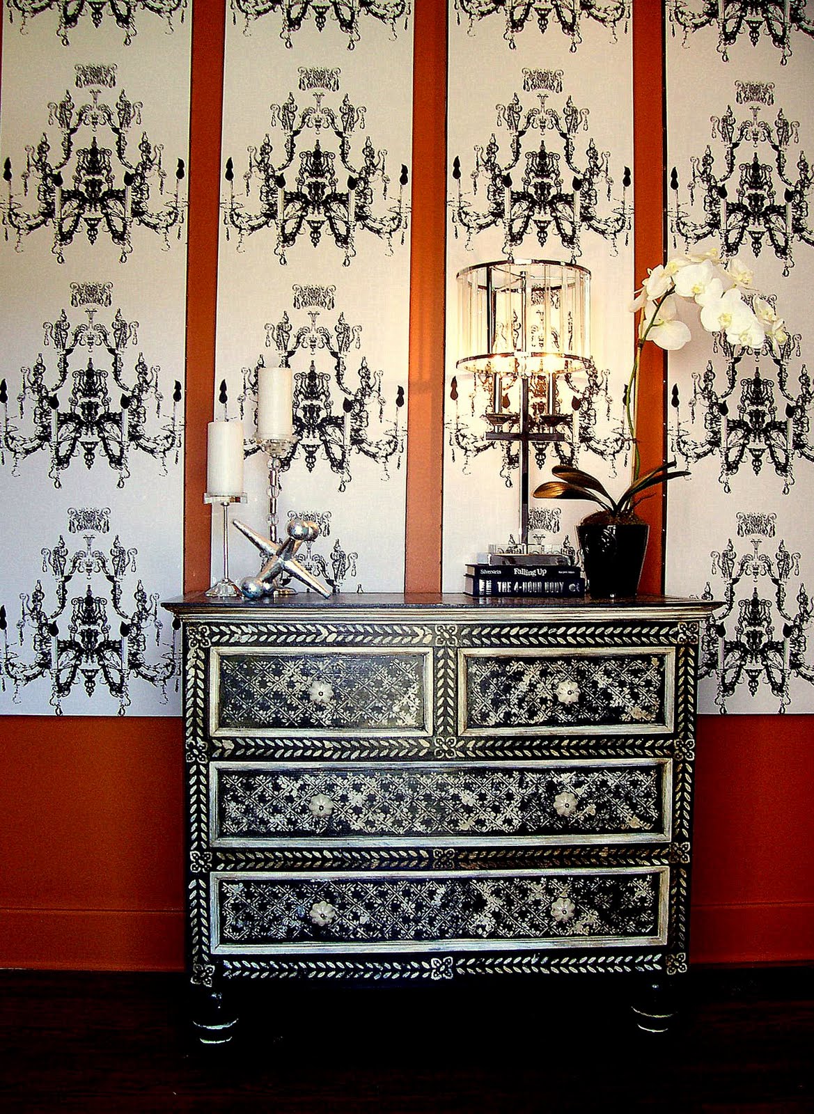
Here is the chest in place.  The foyer is a somewhat difficult space:  it is very long, actually more of a hall than a room.  The homeowner had the idea to define an entrance by the front door by wallpapering the section of the wall behind where the chest would sit and had purchased some graphic black and white paper.  I was concerned about the issues with wallpapering just a section of the wall, including removal later as his taste changed, as well as the problem that he had only ordered one roll.  Even though the pattern is still available, his dye lot was not and matching, even in black and white, can be a problem with different dyelots.  So I suggested wrapping the wallpaper around panels (in this case bi-fold closet doors) to create the effect of a screen. 


To further enhance the screen effect, I bordered the panels in black leather like tape and added polished nickel nailheads.  A coat of rich terracotta paint (my beloved SW Truepenny) provided a rich background for the black and white pattern.

A view down the foyer's long wall shows how the panels help define the area around the front door as an entrance:


This is not the entrance the family uses, so I didn't need to create a landing spot for the debris of life.  However to greet guests, I added a lamp, an orchid, and candles to create ambiance.  The home owners have eclectic taste, so I tried to inject some sleeker more sophisticated elements to the top of the chest to indicate the mix of rustic and refined elements in the rest of the home.  The chrome and lucite lamp had chic sparkle, but it's form actually mimics that of the chandeliers in the paper.  The silver leafed jack sculpture references an x-shaped sculpture in a different area of the foyer hall and adds a touch of whimsy.  More sparkle in the crystal and polished nickle candleholders, and an white orchid in a black cache pot adds an organic touch while maintaining the black and white color story.


5.15.2011

Before and After: Home Office Switcheroo

 
The buffet from underneath the stairs moved into new location.


 I've finally completed my home office switch that I started months ago, after finally finding the right paint color, so I thought it would make a great Metamorphosis Monday project at Between Naps on the Porch.

It can take a while to settle into a house, distilling how you'll really live in it, as opposed to your ideas about how you think you'll do it.  Case in point:  I've lived in the this house about 3 and 1/2 years, and it's taken me that long to sort out the dining room house office situation.  When I moved in, I had just started working for myself, and I pictured hours and hours at my desks, meeting with clients, doing paperwork, etc., so I decided to use the second room in our traditional shotgun (usually used as the dining room) as my home office---it's a much bigger spaced than the other likely candidate---our stair room.  that room, which is right off the kitchen would make a great dining nook....or so I thought.
Here's the original home office--huge exective desk (found abandoned on the street), club chairs and a lateral file.


I found a huge executive desk on the street.  It was in incredible shape--just needed a paint job, well made--lots of drawers.  Perfect I thought.  Unfortunately, it was too big---and became an irrestible landing spot for every piece of debris that entered the house.  Furthermore, I found that while I did spend some time working at home, quite frankly, most of my working time was in the field or in my work area painting--I didn't need that much desk and with a computer, not that much storage.  So I passed the desk on to a friend with a new home and not much furniture, set up an antique round table as a work surface and switched out chairs.
 I liked the way it looked, a lot actually, but the table had too little storage, and was awkward to work on.  Finally, it didn't matter, because though the office wasn't working perfectly, the dining nook was a disaster.  Though it looked okay (through several different paint jobs), it was never comfortable.  It was physically cramped--with one person in the corner at the mercy of dining partners to get in and out.  Further, the ac vent in that room isn't exactly the most efficient, so with a drum shade lighting fixture instead of a ceiling fan, it got really warm and close.  Finally, i gave up, and put the office in the stair-room and the dining room where it traditionally goes (which irritates me cause I want to be different)...and, finally, I feel like it all works.  I'll show the dining room in another post, but I'm going to concentrate on office for now.

Stair room as Dining nook:
You can just make out this buffet to the left of the photo through the door and under the stairs.


The orange stripes.  You can see how tight the space is. 
It looks bigger and brighter, but it was still cramped and hot.
 Stair Room After as Home Office:

The buffet has been moved to old home office.  A metal butler's tray and one of the brown club chairs now occupy its old nook under the stairs.


 Aqua paint (BM 722) now lightens the whole space.  And look--no more stripes.  The tray table provides a landing spot for mail, keys, a lamp for reading, and just what the room needed--a vintage style rotating fan.

The table's mirrored top was broken and one of the silver tips on a leg was missing--so I got it for a steal---$50---I had purchased a perfect one for a client for over $400.  I used tile left over from a friend's project as a free top (okay, I did pay $5 for the foam core board to support it).  A mirror over brightens the space.
The stairs overhead actually make this nook feel really cozy.

For a small space (approx. 12 x 14 sq. feet) with a stair case and two doors---I managed to fit in a lot of furniture--a writing desk with drawers, three bookshelves, a club chair, a tray table, a side table, and an Art Deco china cabinet I use as a pantry (the green room is the kitchen).
I silver leafed the glass so you can't see my canned goods in the pantry.

There was just enough space between the window and the pantry to tuck in a pin up board made from scrapes of other projects (cost--$0).  While the linen photographed as much grayer than the wall, in person, it actually blends in much better.

This is the only real storage I have for books---keeping it edited down to a reasonable amount is a constant struggle for me.

One of the best parts:  except for paint and minor expenses (a small plant, the fan (which was on clearance and futher reduced as a floor model), foam core, it was a free makeover.  I already had all of the the furniture.  It was just in different locations.

I love the new paint color and the layout.  What was a hot cramped space for 4 diners turned about to be a cozy, comfortable space for one or two.  I actually love being in here now, and i find it much easier to concentrate on work now that I'm hidden from the world and can't see what's happening outside on the street.  And, during the move, I've taken the opportunity to purge....It's amazing how much crap you can accumulate without even trying.  Okay, one project down...about 1200 more to go and then I'll be ready for my party on the 28th.   Wish me luck.