7.28.2011

Backsplash Inspiration: or How to Pick a Backsplash in 5 years or Less

Kitchen photo from a couple of years ago.  Minor changes since then, but still no backsplash.


As a professional decorator and decorative painter, I often get called on in to fix bad decisions clients have made in building or renovating.  In fact, one of the most common mistakes homeowners can make when it comes to designing their own homes is by deciding on some non-essential items too soon.  The deal is there are so many decisions to make when designing a home, so many more than people realize:  from big decisions like how big to make the living room to minor ones, like what color outlet covers.  At a certain point toward the end of a project, most people suffer a sort of decision fatigue where it's almost impossible to make another choice, any other choice.  Then, what usually happens, is that a lot of people start making quick impulsive decisions just to get "get'er done."  What I learned is that if you don't love an item or at least are convinced that that item is the right one for the application it  is better to just wait if it's not absolutely necessary.  Usually the right one will come along eventually.

Case in point:  my backsplash.  When we remodeled the kitchen 4 years ago (I can't believe it's been that long), one thing that we didn't select was a backsplash.  This was for various reasons:  cost, Thomas's aversion to most tile, and my fear of becoming bored with an expenisive selection (I do like change, and I can't afford to change out a pricey backsplash very often).  I did toy with some tile options, but the only two that I thought I could commit to long term just didn't work out.  One, a beautiful hand-made irregular glass tile in a beautiful avacado green was just too expensive:  even with a designer discount it was close to $100 a foot and the other tile ended up being too busy (luckily a friend had used on a project and left me have 4 sheets of it to test---they ended up being this table top).  The other option that we almost went with was a fun decopage project like this table; but I was afraid of the difficulty in removing it when (notice I didn't say if) I got tired of it.

So, to make a long story longer, I've spent the last couple of years on backsplash alert--keeping my eyes open for inspiration.  Finally, it's hit.  We went to a local coffee house where the walls are made up of reclaimed barge board in various colors.  We both liked the look of it, and I thought that the various colors could tie together the colors in the room.
It's hard to tell from picture, but there is a lot of distressing and color vation in the different boards.
I thought about using real wood, but again didn't want the cost, the hassle, or the permanency.  Then, another inspiration:  Faux bois---I could fake it like Eddie Ross did on this table top:

 
Fromwww.eddieross.com

And, finally, this morning, I found the perfect color inspiration in this faux barn door from the blog, Young House Love:

from young house love


So, this weekend, I'm gonna bust out all my half used paints in the right colors,
and my rocking grain roller,
a little polyurethane for protection and ease of cleaning, and then get this backsplash party rolling.

I'll keep you posted.

5.19.2011

Faux Moroccan Chest Update

A couple of posts back (here) I showed you how I painted a plain chest to resemble Wisteria's Moroccan chest, and I promised to show you the completed foyer when it was ready.  It is now ready.

Just as a reminder, a quick before of the chest:

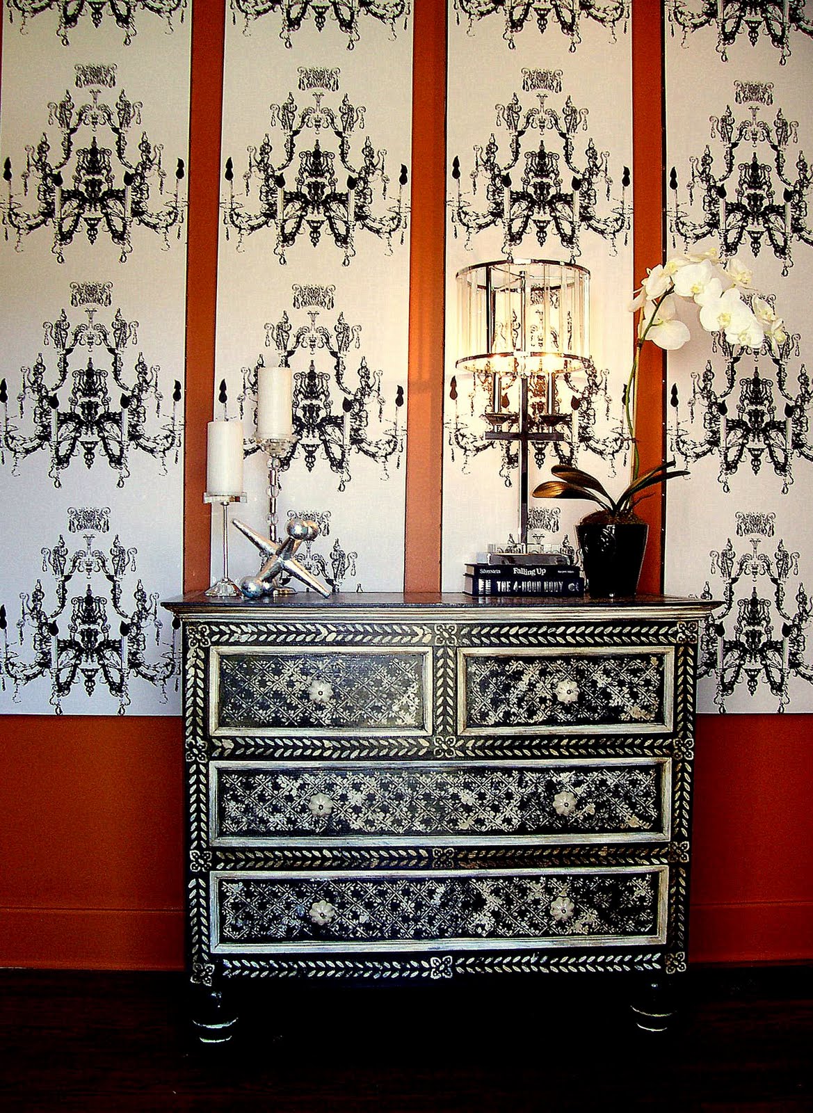
Here is the chest in place.  The foyer is a somewhat difficult space:  it is very long, actually more of a hall than a room.  The homeowner had the idea to define an entrance by the front door by wallpapering the section of the wall behind where the chest would sit and had purchased some graphic black and white paper.  I was concerned about the issues with wallpapering just a section of the wall, including removal later as his taste changed, as well as the problem that he had only ordered one roll.  Even though the pattern is still available, his dye lot was not and matching, even in black and white, can be a problem with different dyelots.  So I suggested wrapping the wallpaper around panels (in this case bi-fold closet doors) to create the effect of a screen. 


To further enhance the screen effect, I bordered the panels in black leather like tape and added polished nickel nailheads.  A coat of rich terracotta paint (my beloved SW Truepenny) provided a rich background for the black and white pattern.

A view down the foyer's long wall shows how the panels help define the area around the front door as an entrance:


This is not the entrance the family uses, so I didn't need to create a landing spot for the debris of life.  However to greet guests, I added a lamp, an orchid, and candles to create ambiance.  The home owners have eclectic taste, so I tried to inject some sleeker more sophisticated elements to the top of the chest to indicate the mix of rustic and refined elements in the rest of the home.  The chrome and lucite lamp had chic sparkle, but it's form actually mimics that of the chandeliers in the paper.  The silver leafed jack sculpture references an x-shaped sculpture in a different area of the foyer hall and adds a touch of whimsy.  More sparkle in the crystal and polished nickle candleholders, and an white orchid in a black cache pot adds an organic touch while maintaining the black and white color story.


5.15.2011

Before and After: Home Office Switcheroo

 
The buffet from underneath the stairs moved into new location.


 I've finally completed my home office switch that I started months ago, after finally finding the right paint color, so I thought it would make a great Metamorphosis Monday project at Between Naps on the Porch.

It can take a while to settle into a house, distilling how you'll really live in it, as opposed to your ideas about how you think you'll do it.  Case in point:  I've lived in the this house about 3 and 1/2 years, and it's taken me that long to sort out the dining room house office situation.  When I moved in, I had just started working for myself, and I pictured hours and hours at my desks, meeting with clients, doing paperwork, etc., so I decided to use the second room in our traditional shotgun (usually used as the dining room) as my home office---it's a much bigger spaced than the other likely candidate---our stair room.  that room, which is right off the kitchen would make a great dining nook....or so I thought.
Here's the original home office--huge exective desk (found abandoned on the street), club chairs and a lateral file.


I found a huge executive desk on the street.  It was in incredible shape--just needed a paint job, well made--lots of drawers.  Perfect I thought.  Unfortunately, it was too big---and became an irrestible landing spot for every piece of debris that entered the house.  Furthermore, I found that while I did spend some time working at home, quite frankly, most of my working time was in the field or in my work area painting--I didn't need that much desk and with a computer, not that much storage.  So I passed the desk on to a friend with a new home and not much furniture, set up an antique round table as a work surface and switched out chairs.
 I liked the way it looked, a lot actually, but the table had too little storage, and was awkward to work on.  Finally, it didn't matter, because though the office wasn't working perfectly, the dining nook was a disaster.  Though it looked okay (through several different paint jobs), it was never comfortable.  It was physically cramped--with one person in the corner at the mercy of dining partners to get in and out.  Further, the ac vent in that room isn't exactly the most efficient, so with a drum shade lighting fixture instead of a ceiling fan, it got really warm and close.  Finally, i gave up, and put the office in the stair-room and the dining room where it traditionally goes (which irritates me cause I want to be different)...and, finally, I feel like it all works.  I'll show the dining room in another post, but I'm going to concentrate on office for now.

Stair room as Dining nook:
You can just make out this buffet to the left of the photo through the door and under the stairs.


The orange stripes.  You can see how tight the space is. 
It looks bigger and brighter, but it was still cramped and hot.
 Stair Room After as Home Office:

The buffet has been moved to old home office.  A metal butler's tray and one of the brown club chairs now occupy its old nook under the stairs.


 Aqua paint (BM 722) now lightens the whole space.  And look--no more stripes.  The tray table provides a landing spot for mail, keys, a lamp for reading, and just what the room needed--a vintage style rotating fan.

The table's mirrored top was broken and one of the silver tips on a leg was missing--so I got it for a steal---$50---I had purchased a perfect one for a client for over $400.  I used tile left over from a friend's project as a free top (okay, I did pay $5 for the foam core board to support it).  A mirror over brightens the space.
The stairs overhead actually make this nook feel really cozy.

For a small space (approx. 12 x 14 sq. feet) with a stair case and two doors---I managed to fit in a lot of furniture--a writing desk with drawers, three bookshelves, a club chair, a tray table, a side table, and an Art Deco china cabinet I use as a pantry (the green room is the kitchen).
I silver leafed the glass so you can't see my canned goods in the pantry.

There was just enough space between the window and the pantry to tuck in a pin up board made from scrapes of other projects (cost--$0).  While the linen photographed as much grayer than the wall, in person, it actually blends in much better.

This is the only real storage I have for books---keeping it edited down to a reasonable amount is a constant struggle for me.

One of the best parts:  except for paint and minor expenses (a small plant, the fan (which was on clearance and futher reduced as a floor model), foam core, it was a free makeover.  I already had all of the the furniture.  It was just in different locations.

I love the new paint color and the layout.  What was a hot cramped space for 4 diners turned about to be a cozy, comfortable space for one or two.  I actually love being in here now, and i find it much easier to concentrate on work now that I'm hidden from the world and can't see what's happening outside on the street.  And, during the move, I've taken the opportunity to purge....It's amazing how much crap you can accumulate without even trying.  Okay, one project down...about 1200 more to go and then I'll be ready for my party on the 28th.   Wish me luck.

5.11.2011

How to Choose the Perfect Paint Colour in Approximately 115 Easy Steps

Do you have one of THOSE rooms?  One of those rooms that, because of location or openings or variety of need functions or lighting is almost impossible to decorate, at least in an effective way?  I have one.  I have one that I've been trying to find a paint color for, not to mention furniture plan for 3 1/2 years.  I do this for a living and have had input from other designer friends, and so far the perfect color has escaped me.  I'm hoping I've finally nailed it. 

Here, you can see a glimpse of my problem room through the door way to the right--where the stripes are.  The stair-room (as I call it) serves as a passage to the kitchen, as well as the stairwell to the second floor.  As such, 5 rooms open off of it, creating problems with color selection.  And, for various reasons, all of those rooms are a different color.  So that is part of the problem---trying to co-ordinate several colors---but honestly, that's not the major issue since, though I have a lot of colours in the house, I only like a narrow range of colors---what I think of as spice tones--Moroccan colors---teals, aquas, ochres, reds, earthy greens---all saturated, but muted.  The real problem is that the room has a strange light situation--it receives direct natural light from two windows in different locations, plus spill over light from the rooms upstairs---and for what ever reason, the light seems to drain the life out of color---I've tried several blue-greens that I've specified with great success for many different clients, and they all die in that hallway---turning a dead shark grey.  Anyway, I think I've finally found a winner, so join me on my journey to finally have a decent stair-room:


Here is the original color, Sherwin Williams True Penny.  I had used on a project and fell in love.  And I still think it's a beautiful color which worked beautifully with the surrounding colours.  But, in the end, it was just too much...too intense.

To cut the intensity, I striped the downstairs portion of the room, which I then used as a dining space.  I still love horizontal stripes even if they're very 2002 Trading Spaces, and it helped, but not enough.

Next, came aqua stripes, which I really liked, but I could never commit to that aqua going all the way up the staircase--it was just a little too intense, and after the orange, I was scared of intense color.  So for a long time, the room stayed like that:  aqua stripes on three walls, orange up the the stairs.
Then, I decided to change things---the space never really worked well as a dining area--too cramped with too little air flow, so I decided to move it to what was the office and put the office in there instead.  In the midst of this, I rediscovered my favorite Elle Decor cover of all time from 1999 or so and decided to let it help guide my decisions.
I found inspiration at the House of Turquoise and saw this beautiful paint color, Sherwin Williams Rainwashed:
In my office, though, it turned into a dead gray.  If you look, you can just make it out under the aqua stripe to the left of the window.
 I finally, in desperation, picked a color, but it has, from day one, been a disappointment:  flat, cold, chalky.  So much so, I never finished painting the entire office or stair-room and never posted a reveal.  In fact, if you look on the desk you can see two sample cans of paint, the result of my search for the perfect blue/green.  I had given up hope and abandoned the search.

Then last night, I was flipping through an old House Beautiful, and saw this:
The Grace Home room immediately spoke to me.  So far this morning, I have ignored pressing work to run to Benjamin Moore and have two samples of Dolphin's Cove mixed, one a 200% formula....i painted a large sample board, and I think I love it----it's bright, but not garish, has a vintage feel, intense enough to stand up to surrounding colours, but not too intense.  please wish me luck...i can't do this again.

5.09.2011

How to Fake a Moroccan Chest: A Metamorphosis Monday project


Closeup of drawer and new knob.

Recently, I've just done a fun makeover on a client's existing piece of furniture, trying to replicate the look of a fabulous bone/ivory inlaid Moroccan style chest, which I thought would be a great Metamorphosis Monday (at Between Naps on the Porch) post.   The client owned an existing chest in the correct size for their foyer, but the dark mahogany finish on the sturdy imported dresser was much too casual and, quite frankly, boring to carry the entry:

The chest before.


An inexpensive piece from the client's previous home, it was in good shape and the right size for the space, but the homeowners wanted something more exciting, something more like this fabulous chest from Wisteria:

While Wisteria's price ($2,995) is fair for such an intricate and decorative piece, with a new house to furnish, the clients preferred to make-over their existing chest and use that money elsewhere.  Since the chests were of such similiar proportions, I was confident that I could mimic the feel of the bone inlaid chest with black paint and white stenciling.

Before I show process pictures, though, a note about using inspiration.  I knew from the beginning that I could replicate the feel of the Wisteria chest, but I knew that I could not completely replicate it.  First, and most importantly, the existing chest, while almost exactly the same dimensions and with the same drawer layout, was not as finely made or proportioned as the Wisteria one.  If you look at the above photos, you'll see the client chest has large bulb feet and thick, almost crude, moulding around each drawer rather than being flat fronted as the Wisteria one.    Secondly, the piece will get heavy use in the entry, so I decided to use oil-based products for durability:  that meant I would not be able to get as fine a result with the stenciling, and that I could not use my latex mother of pearl glaze over the white stencils.  Therefore, from the beginning, I decided to go for a more rustic, aged approach rather than a direct copy.

1.  First step:  Clean thoroughly, lightly sand, and apply a good quality adhesive primer.  Adhesive primers are designed specifically to stick to glossy, previously finished surfaces such as furniture and cabinets.  They adhere so well that there is no need to strip the previous finish...just rough it up slightly.  Since I was painting the chest black, I had the paint store add black pigment to the primer to get it to as dark a grey as possible to make the painting process easier.  Because of the dark primer, I was able to achieve full coverage with only 2 thin coats.

2.  Paint it black.  Use multiple thin coats instead of one thick one, and lightly sand between each coat with extra-fine steel wool---it does make a difference.

3. Add your white details with stencils and brushes.  Since I was going for a rustic look, I didn't tape the moulding.  However, taping would be needed if you were going for a crisp, inlaid look.


4.  Apply finish if needed.  I often find that if I use oil paint and sand the topcoat thoroughly with extra-fine steel wool, no additional finish is needed.  But in this case I wanted my finish to achieve two things--give a translucent finish to the white details to suggest bone and to add the look of age, so after polishing the chest with steel wool, I brushed on and irregularly wiped off wood stain to finish.
Detail showing mottled effect achieved by stain top coat.

5.  Add co-ordinating knobs.  To finish, I replaced the existing pulls with new knobs with an aged ivory look.  I did retain the original back plates for a more finished look.

After, and ready for delivery.  When the foyer is finished, I'll do a follow up post.


 To Recap:

Before


Inspiration


After

4.16.2011

Really? Toemaggedon is the U.S.'s Biggest Issue?


I tend to live under a rock...at least as far as the news is concerned.  Frankly, watching 24 hour cable and network news reporting disaster after disaster (many of them over-sensationalized) as well as blow hard pundits (of both sides) spewing ill-formed opinion as fact doesn't make me feel better informed...it just makes my head hurt and my stomach feel a little nauseous.  Therefore, I missed the controversy surrounding this ad from J. Crew.  Apparently it's been discussed extensively on Fox news and made the Today show, as well as ABC.   And based on various polls, comment boards etc, support for (typical statement:  "he's a little boy playing with a clearly adoring mother, who cares?") and against (typical statement:  "he's scarred for life.  how dare she.  little boys should never, ever play with girl things ever.  he's on the direct path to becoming gay/transgendered/drag queen")  is split about evenly.

As a former sissyboy (and let me assure you my turning from a sissy boy to a sissy man was not the result of my parents' indulging (which they did...I had more Barbies than my sister) me)....i didn't turn into a sissy because I played with Barbies...I wanted to play with Barbies because I was a sissy.  Trust me, I know plenty of sissies who were never, ever allowed to touch a traditionally female toy...(but they didn't make them stop wanting to or from growing up sissified).  I favor Jon Stewart's opinion here.

Here's my own take:

1.  One thing that frightens me a lot, even more than any stupid talking points about painted toenails as the first step in transforming this toddler into some sort of crazed transgendered psychopath  is that in Fox's Dr. Ablow's article and the Today show segment, as well as other "news" sources, the picture is described as "a mother painting her son's toes."  One intro:  "j.crew has an ad with a woman painting her son's toenails.."  On one voice over, it states "...but take a closer look...she's applying nail polish..."

The problem:  look at the picture.  She's not actually painting his toes...they're already painted and the bottle of polish is closed.  Why this bothers me:  I think that new programs, even if they're heavy infotainment, should be accurate.  Sure, the picture implies that she painted his toes, but that's not what is actually happening in the photo.  Even the caption,  "Lucky for me I ended up with a boy whose favorite color is pink.  Painting toenails is way more fun in neon" doesn't actually say that she paints them.  Let's be real...even though for the photo shoot Beckett likely had a professional manicurist paint his toenails, I'm sure she's the probably the one who paints them.  but not necessarily...maybe he paints his own, maybe his dad, grandfather, or other relative does...who knows.  We aren't actually shown his toes being painted or told who does usually paint them or if this is regular behavior of  even told whose idea painting his toes was.  That doesn't stop the fact that she is described as painting his nails and, in some cases, as pressuring him to paint them.

I know that some may think this is a minor point missing the greater issues in the photo, but aren't you a little frightened of news people who can't even accurately describe a photo that is right in front of them?  God knows how accurate they are in  any situation even slightly open to interpretation.  That thought scares the shit out of me.  People with no idea of what they are talking about influencing others.

2.  I find the resulting brouhaha to be an eye-opening experience in how standing in different shoes can so dramatically change what that viewer sees.  Some pundits and commenters see a provocative liberal challenge to accepted standards of masculinity and traditional values, some see coldly calculated opportunism (ad pitchman, "i bet if we show a boy in nail polish, this thing will go viral!"), and some see it as completely innocent (executive has cute kid with what she considers cute behavior, so she features him in ad).

My take is somewhere in the middle.  One of the brightest things J.Crew and Jenna Lyons have done in the revitalization of the brand is the use of her as company muse and lifestyle model, much like all those ads of Ralph Lauren and wife in location appropriate get ups (WASP wear, island whites, cowboy coture) posing in their various homes decorated to co-ordinate, or Halston in the 1970s partying at Studio 54 surrounded by a gaggle of society and Hollywood beauties draped in his clothes...in each case a designer and/or executive showcases the company's wear in their daily lives doing their regular glamorous routine.  The idea being---wear this Halston knit...be fabulous at the exclusive disco...just like he is!  You see it today with the more successful bloggers---their whole lives (at least that part shared on their blogs) is branded...you see them doing and wearing things that make you think, "That is so her!  I'd love to be more like her.  I'm glad I read this blog about this fabulous blogger that does these bloggy things."

Jenna has carefully crafted and marketed this image of herself  as the prototypical J. Crew woman:   the new superwoman...the 80's having it all woman 2.0---glamorous, high-paid, successful career, beautiful home featured in glossy magazines, but with wonderful home life complete with beautiful child.  I really think the whole point of the ad was merely to show this:  look at me, i am a glamorous career woman...but i spend Sat. bonding with child....and look, i'm so hip, i let him paint his nails...aren't i hip and bohemian?   but I still look fabulous doing...buy this shirt and polish so you and your family can be this fabulous.

did they have another agenda? who knows, but since they have yet to issue a statement, as of now going the tasteful, "we have no comment as we consider this a non-issue and don't want to add fuel to the fire"  route as opposed to having a statement prepared, i don't really think so.  my feeling is that a group of Manhattan "taste makers,"  fashion types, and marketers really consider a boy in nail polish a non-issue as they work in a world where Andre Leon Talley swathed in floor-length cloaks and Marc Jacobs wearing skirts to formal events on a regular basis doesn't result in a batted false eye-lash.

3.  In a world with an energy crises, starvation, tsunami's', nuclear power plant melt-downs, suicides as the result of bullying, widespread genocide, plummeting literacy rates, rising health care costs,  etc.  who really gives a shit if some little boy that is not even related to you likes pink toe nail polish, even if he's in a national ad?

3.20.2011

Unanswered Prayers and the Art of Everyday Living

Clothes line in Italy, 123rf.com


Clotheslines in Burano, Italy (an island in the Venetian lagoon) via Superstock

Another clothesline in Italy....why does everything just look better in Italy?
When I was still a teen (approximately 115 years ago when claw bangs, parachute pants, and jazz shoes were legitimate fashion choices), Garth Brooks had a popular song, "Unanswered Prayers," where he rejoiced in the way his life worked out since God didn't grant his earlier wishes.  Looking at the issue from the other side, Truman Capote named his bitter, unfinished, semi-biographical final novel "Answered Prayers," taking its title from St. Teresa of Avila, "There are more tears shed over answered prayers than unanswered ones."  In short, human beings are generally very bad at determining which situations and choices will result in the best for them.  Sometimes, the greatest outcomes derive from the worst beginnings.  In fact, a lot of my current happiness can be directly linked to being fired from my dream job in my 20s.

Recently, I have been reminded of this again.  Our dryer is on the fritz, sometimes working, more often not.  And, quite frankly, there is no room in our budget to replace it and we're also hesitant to risk paying a couple of hundred dollars to fix it with no guarantee of success.  I also don't want the inconvenience and expense of a laundromat dryer--so what to do?  Solution:  I went old school...back to my roots.  I.e.  I broke out a clothesline (we are fortunate enough to have an enclosed backyard, so we won't be annoying any potentially high-toned neighbors who might object to seeing our dainties exposed to the open air).

I started hanging out the clothes because of necessity, but I've come to enjoy it.  It reminds me of my childhood on the farm, where we (usually I was stuck with this chore, but that might be selective memory) hung our clothes out all summer...I had forgotten the wonderful smell--a combination of sunshine and fresh air--of clothes dried on the line.  Nothing beats climbing between sun-dried sheets--not even ironing them with lavender water.  It also makes me feel like I'm doing something, even though small, to help the environment and cut our costs.  It also reminds me of the summers I spent in Italy.  I always try to live "European"---seasonal food, the respect for leisure, that certain style that just invades every aspect of their lives--I had forgotten, though, the bright lines of clothes draped (even in the major cities) across and between buildings...the bright clothes fluttering like medieval banners...a splash of color and art in everyday life.