5.19.2011

Faux Moroccan Chest Update

A couple of posts back (here) I showed you how I painted a plain chest to resemble Wisteria's Moroccan chest, and I promised to show you the completed foyer when it was ready.  It is now ready.

Just as a reminder, a quick before of the chest:

Here is the chest in place.  The foyer is a somewhat difficult space:  it is very long, actually more of a hall than a room.  The homeowner had the idea to define an entrance by the front door by wallpapering the section of the wall behind where the chest would sit and had purchased some graphic black and white paper.  I was concerned about the issues with wallpapering just a section of the wall, including removal later as his taste changed, as well as the problem that he had only ordered one roll.  Even though the pattern is still available, his dye lot was not and matching, even in black and white, can be a problem with different dyelots.  So I suggested wrapping the wallpaper around panels (in this case bi-fold closet doors) to create the effect of a screen. 


To further enhance the screen effect, I bordered the panels in black leather like tape and added polished nickel nailheads.  A coat of rich terracotta paint (my beloved SW Truepenny) provided a rich background for the black and white pattern.

A view down the foyer's long wall shows how the panels help define the area around the front door as an entrance:


This is not the entrance the family uses, so I didn't need to create a landing spot for the debris of life.  However to greet guests, I added a lamp, an orchid, and candles to create ambiance.  The home owners have eclectic taste, so I tried to inject some sleeker more sophisticated elements to the top of the chest to indicate the mix of rustic and refined elements in the rest of the home.  The chrome and lucite lamp had chic sparkle, but it's form actually mimics that of the chandeliers in the paper.  The silver leafed jack sculpture references an x-shaped sculpture in a different area of the foyer hall and adds a touch of whimsy.  More sparkle in the crystal and polished nickle candleholders, and an white orchid in a black cache pot adds an organic touch while maintaining the black and white color story.


5.15.2011

Before and After: Home Office Switcheroo

 
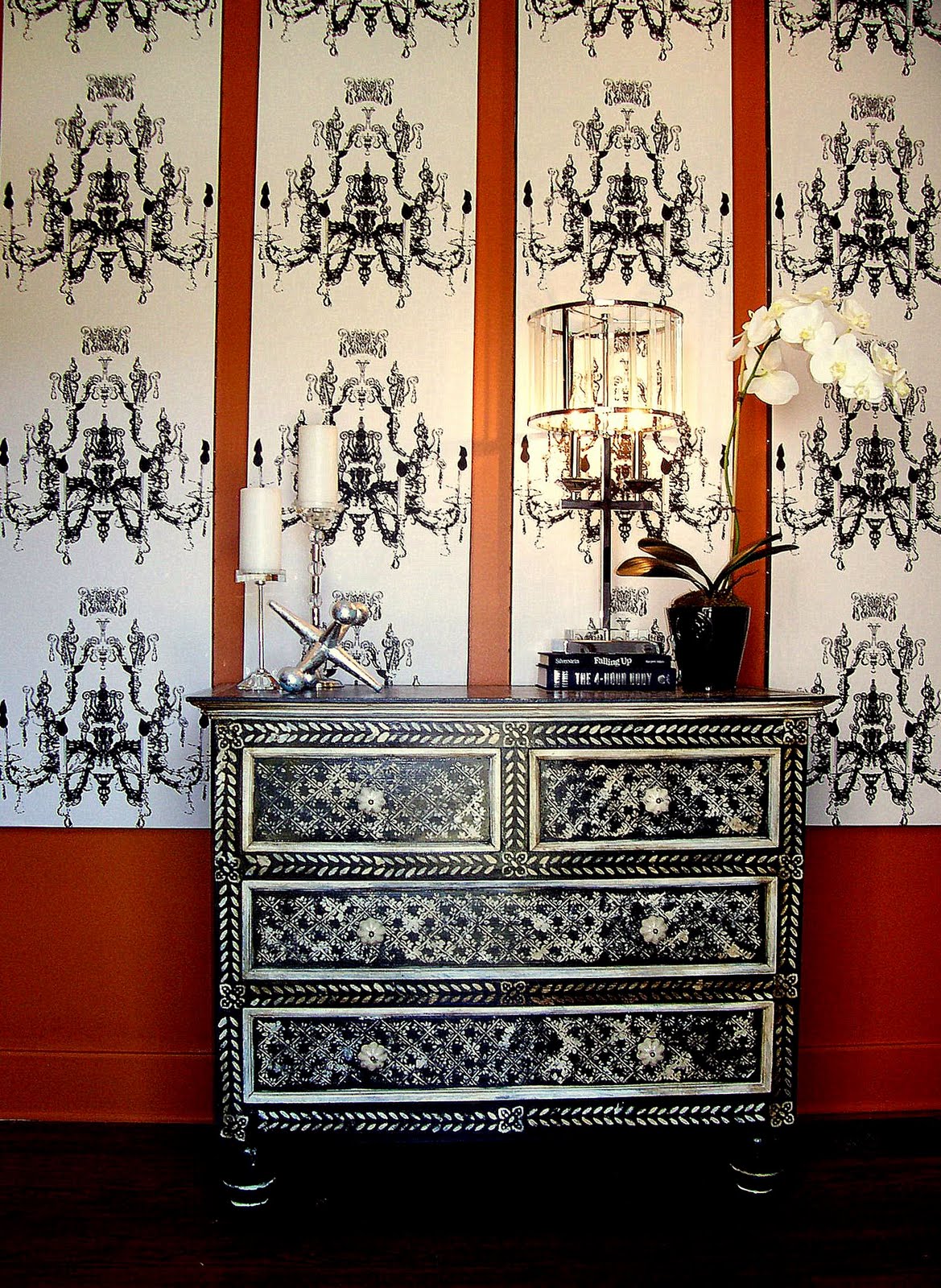
The buffet from underneath the stairs moved into new location.


 I've finally completed my home office switch that I started months ago, after finally finding the right paint color, so I thought it would make a great Metamorphosis Monday project at Between Naps on the Porch.

It can take a while to settle into a house, distilling how you'll really live in it, as opposed to your ideas about how you think you'll do it.  Case in point:  I've lived in the this house about 3 and 1/2 years, and it's taken me that long to sort out the dining room house office situation.  When I moved in, I had just started working for myself, and I pictured hours and hours at my desks, meeting with clients, doing paperwork, etc., so I decided to use the second room in our traditional shotgun (usually used as the dining room) as my home office---it's a much bigger spaced than the other likely candidate---our stair room.  that room, which is right off the kitchen would make a great dining nook....or so I thought.
Here's the original home office--huge exective desk (found abandoned on the street), club chairs and a lateral file.


I found a huge executive desk on the street.  It was in incredible shape--just needed a paint job, well made--lots of drawers.  Perfect I thought.  Unfortunately, it was too big---and became an irrestible landing spot for every piece of debris that entered the house.  Furthermore, I found that while I did spend some time working at home, quite frankly, most of my working time was in the field or in my work area painting--I didn't need that much desk and with a computer, not that much storage.  So I passed the desk on to a friend with a new home and not much furniture, set up an antique round table as a work surface and switched out chairs.
 I liked the way it looked, a lot actually, but the table had too little storage, and was awkward to work on.  Finally, it didn't matter, because though the office wasn't working perfectly, the dining nook was a disaster.  Though it looked okay (through several different paint jobs), it was never comfortable.  It was physically cramped--with one person in the corner at the mercy of dining partners to get in and out.  Further, the ac vent in that room isn't exactly the most efficient, so with a drum shade lighting fixture instead of a ceiling fan, it got really warm and close.  Finally, i gave up, and put the office in the stair-room and the dining room where it traditionally goes (which irritates me cause I want to be different)...and, finally, I feel like it all works.  I'll show the dining room in another post, but I'm going to concentrate on office for now.

Stair room as Dining nook:
You can just make out this buffet to the left of the photo through the door and under the stairs.


The orange stripes.  You can see how tight the space is. 
It looks bigger and brighter, but it was still cramped and hot.
 Stair Room After as Home Office:

The buffet has been moved to old home office.  A metal butler's tray and one of the brown club chairs now occupy its old nook under the stairs.


 Aqua paint (BM 722) now lightens the whole space.  And look--no more stripes.  The tray table provides a landing spot for mail, keys, a lamp for reading, and just what the room needed--a vintage style rotating fan.

The table's mirrored top was broken and one of the silver tips on a leg was missing--so I got it for a steal---$50---I had purchased a perfect one for a client for over $400.  I used tile left over from a friend's project as a free top (okay, I did pay $5 for the foam core board to support it).  A mirror over brightens the space.
The stairs overhead actually make this nook feel really cozy.

For a small space (approx. 12 x 14 sq. feet) with a stair case and two doors---I managed to fit in a lot of furniture--a writing desk with drawers, three bookshelves, a club chair, a tray table, a side table, and an Art Deco china cabinet I use as a pantry (the green room is the kitchen).
I silver leafed the glass so you can't see my canned goods in the pantry.

There was just enough space between the window and the pantry to tuck in a pin up board made from scrapes of other projects (cost--$0).  While the linen photographed as much grayer than the wall, in person, it actually blends in much better.

This is the only real storage I have for books---keeping it edited down to a reasonable amount is a constant struggle for me.

One of the best parts:  except for paint and minor expenses (a small plant, the fan (which was on clearance and futher reduced as a floor model), foam core, it was a free makeover.  I already had all of the the furniture.  It was just in different locations.

I love the new paint color and the layout.  What was a hot cramped space for 4 diners turned about to be a cozy, comfortable space for one or two.  I actually love being in here now, and i find it much easier to concentrate on work now that I'm hidden from the world and can't see what's happening outside on the street.  And, during the move, I've taken the opportunity to purge....It's amazing how much crap you can accumulate without even trying.  Okay, one project down...about 1200 more to go and then I'll be ready for my party on the 28th.   Wish me luck.

5.11.2011

How to Choose the Perfect Paint Colour in Approximately 115 Easy Steps

Do you have one of THOSE rooms?  One of those rooms that, because of location or openings or variety of need functions or lighting is almost impossible to decorate, at least in an effective way?  I have one.  I have one that I've been trying to find a paint color for, not to mention furniture plan for 3 1/2 years.  I do this for a living and have had input from other designer friends, and so far the perfect color has escaped me.  I'm hoping I've finally nailed it. 

Here, you can see a glimpse of my problem room through the door way to the right--where the stripes are.  The stair-room (as I call it) serves as a passage to the kitchen, as well as the stairwell to the second floor.  As such, 5 rooms open off of it, creating problems with color selection.  And, for various reasons, all of those rooms are a different color.  So that is part of the problem---trying to co-ordinate several colors---but honestly, that's not the major issue since, though I have a lot of colours in the house, I only like a narrow range of colors---what I think of as spice tones--Moroccan colors---teals, aquas, ochres, reds, earthy greens---all saturated, but muted.  The real problem is that the room has a strange light situation--it receives direct natural light from two windows in different locations, plus spill over light from the rooms upstairs---and for what ever reason, the light seems to drain the life out of color---I've tried several blue-greens that I've specified with great success for many different clients, and they all die in that hallway---turning a dead shark grey.  Anyway, I think I've finally found a winner, so join me on my journey to finally have a decent stair-room:


Here is the original color, Sherwin Williams True Penny.  I had used on a project and fell in love.  And I still think it's a beautiful color which worked beautifully with the surrounding colours.  But, in the end, it was just too much...too intense.

To cut the intensity, I striped the downstairs portion of the room, which I then used as a dining space.  I still love horizontal stripes even if they're very 2002 Trading Spaces, and it helped, but not enough.

Next, came aqua stripes, which I really liked, but I could never commit to that aqua going all the way up the staircase--it was just a little too intense, and after the orange, I was scared of intense color.  So for a long time, the room stayed like that:  aqua stripes on three walls, orange up the the stairs.
Then, I decided to change things---the space never really worked well as a dining area--too cramped with too little air flow, so I decided to move it to what was the office and put the office in there instead.  In the midst of this, I rediscovered my favorite Elle Decor cover of all time from 1999 or so and decided to let it help guide my decisions.
I found inspiration at the House of Turquoise and saw this beautiful paint color, Sherwin Williams Rainwashed:
In my office, though, it turned into a dead gray.  If you look, you can just make it out under the aqua stripe to the left of the window.
 I finally, in desperation, picked a color, but it has, from day one, been a disappointment:  flat, cold, chalky.  So much so, I never finished painting the entire office or stair-room and never posted a reveal.  In fact, if you look on the desk you can see two sample cans of paint, the result of my search for the perfect blue/green.  I had given up hope and abandoned the search.

Then last night, I was flipping through an old House Beautiful, and saw this:
The Grace Home room immediately spoke to me.  So far this morning, I have ignored pressing work to run to Benjamin Moore and have two samples of Dolphin's Cove mixed, one a 200% formula....i painted a large sample board, and I think I love it----it's bright, but not garish, has a vintage feel, intense enough to stand up to surrounding colours, but not too intense.  please wish me luck...i can't do this again.

5.09.2011

How to Fake a Moroccan Chest: A Metamorphosis Monday project


Closeup of drawer and new knob.

Recently, I've just done a fun makeover on a client's existing piece of furniture, trying to replicate the look of a fabulous bone/ivory inlaid Moroccan style chest, which I thought would be a great Metamorphosis Monday (at Between Naps on the Porch) post.   The client owned an existing chest in the correct size for their foyer, but the dark mahogany finish on the sturdy imported dresser was much too casual and, quite frankly, boring to carry the entry:

The chest before.


An inexpensive piece from the client's previous home, it was in good shape and the right size for the space, but the homeowners wanted something more exciting, something more like this fabulous chest from Wisteria:

While Wisteria's price ($2,995) is fair for such an intricate and decorative piece, with a new house to furnish, the clients preferred to make-over their existing chest and use that money elsewhere.  Since the chests were of such similiar proportions, I was confident that I could mimic the feel of the bone inlaid chest with black paint and white stenciling.

Before I show process pictures, though, a note about using inspiration.  I knew from the beginning that I could replicate the feel of the Wisteria chest, but I knew that I could not completely replicate it.  First, and most importantly, the existing chest, while almost exactly the same dimensions and with the same drawer layout, was not as finely made or proportioned as the Wisteria one.  If you look at the above photos, you'll see the client chest has large bulb feet and thick, almost crude, moulding around each drawer rather than being flat fronted as the Wisteria one.    Secondly, the piece will get heavy use in the entry, so I decided to use oil-based products for durability:  that meant I would not be able to get as fine a result with the stenciling, and that I could not use my latex mother of pearl glaze over the white stencils.  Therefore, from the beginning, I decided to go for a more rustic, aged approach rather than a direct copy.

1.  First step:  Clean thoroughly, lightly sand, and apply a good quality adhesive primer.  Adhesive primers are designed specifically to stick to glossy, previously finished surfaces such as furniture and cabinets.  They adhere so well that there is no need to strip the previous finish...just rough it up slightly.  Since I was painting the chest black, I had the paint store add black pigment to the primer to get it to as dark a grey as possible to make the painting process easier.  Because of the dark primer, I was able to achieve full coverage with only 2 thin coats.

2.  Paint it black.  Use multiple thin coats instead of one thick one, and lightly sand between each coat with extra-fine steel wool---it does make a difference.

3. Add your white details with stencils and brushes.  Since I was going for a rustic look, I didn't tape the moulding.  However, taping would be needed if you were going for a crisp, inlaid look.


4.  Apply finish if needed.  I often find that if I use oil paint and sand the topcoat thoroughly with extra-fine steel wool, no additional finish is needed.  But in this case I wanted my finish to achieve two things--give a translucent finish to the white details to suggest bone and to add the look of age, so after polishing the chest with steel wool, I brushed on and irregularly wiped off wood stain to finish.
Detail showing mottled effect achieved by stain top coat.

5.  Add co-ordinating knobs.  To finish, I replaced the existing pulls with new knobs with an aged ivory look.  I did retain the original back plates for a more finished look.

After, and ready for delivery.  When the foyer is finished, I'll do a follow up post.


 To Recap:

Before


Inspiration


After